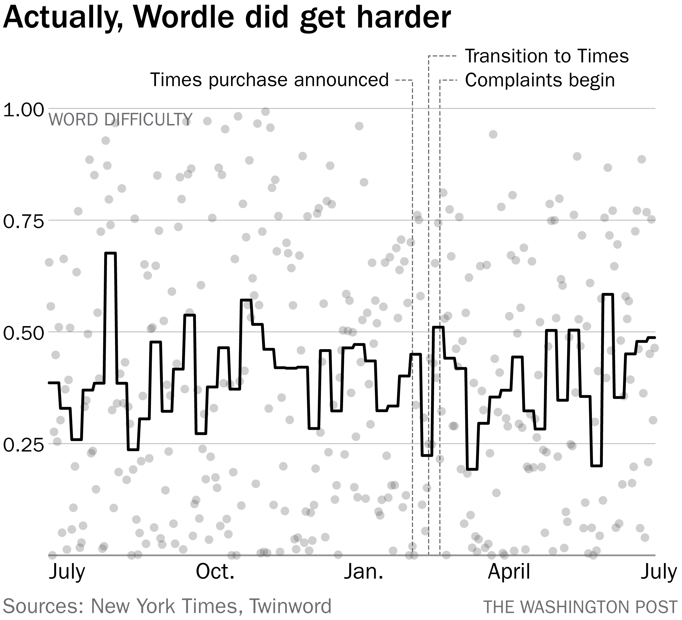
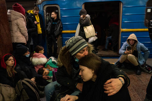
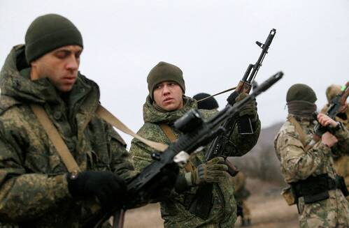
| Did an ally forward this to you? Sign up here. Since you are reading a newsletter centered on data visualization, I will assume that you've probably come across this image before. 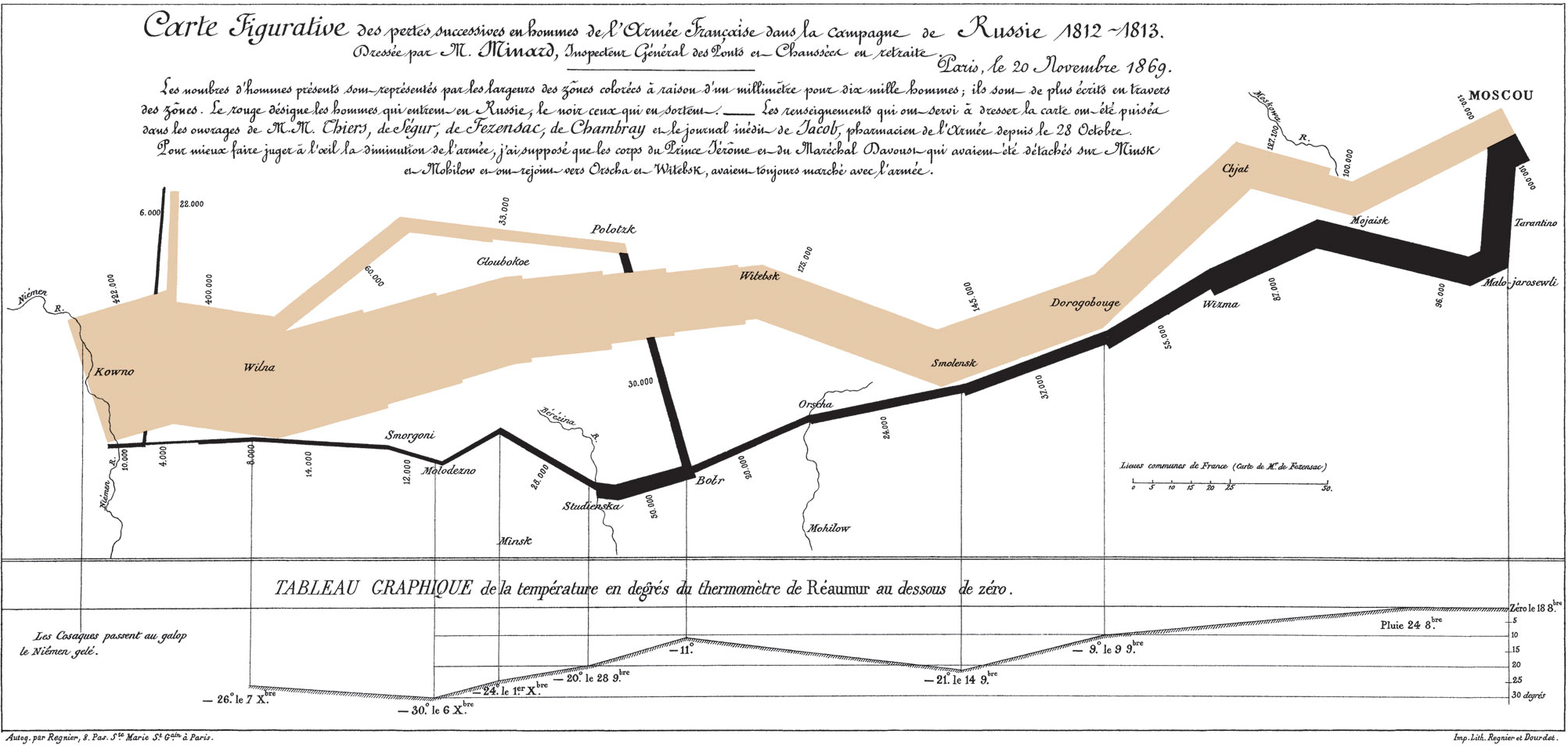 Charles Minard's 1869 map of Napoleon's attempted invasion of Russia. (Wikimedia Commons) | That is a visualization created by Charles Minard in 1869, showing Napoleon Bonaparte's 1812 attempt to capture Moscow with French forces. The tan line shows France's initial invasion, the width of the line indicating the number of soldiers involved in the effort. As the column moves east — to the right, on the diagram — groups break off to engage Russian forces in other cities. But the important pattern is that the tan line narrows: France begins hemorrhaging soldiers. The black line that begins after arrival at Moscow shows the French retreat, with different points in that departure connected to the graph at the bottom that shows how temperatures were falling. The black line arrives back at Russia's western border pencil-thin. Napoleon's invasion became a history lesson and Minard's depiction of it a hallmark of how to depict complex information elegantly. In the current moment, of course, it's a reminder of something else entirely. Russia's invasion, launched in earnest on Wednesday night, forced international audiences to rapidly get up to speed on the geography of Ukraine. Russian President Vladimir Putin at first focused his country's attention on two regions in eastern Ukraine in which Russia had for years backed separatist groups. But as the invasion began with a series of airstrikes, it quickly became apparent that Russia was engaged in a countrywide attack. Understanding the importance of reports of explosions in Kharkiv, Lviv and Kyiv meant understanding that those cities sat well outside the purportedly contested regions. By Thursday morning, The Washington Post's map of the incursion made very clear very quickly the scale of what was underway. 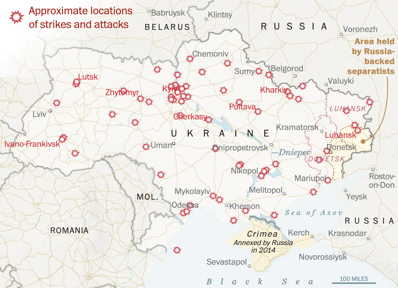 The Washington Post's map of the invasion of Ukraine, as of Thursday morning. | We don't often think of maps as data visualization but, of course, they are. They are geographic data, visualized; they are community data and infrastructural data made visually obvious. In this context, they are conduits for information about war. The Minard diagram isn't a traditional map but it is a map nonetheless; it uses geographic positioning to tell a story. In past conflicts, maps have been instrumental for explaining what's happening. During World War II, newspapers frequently carried large maps on their front pages, showing how Allied forces were pressuring Nazi Germany and its allies. Here, for example, is an Associated Press map that was published in 1944, showing the path of bombers from Britain toward the Soviet Union — toward what is now Ukraine. 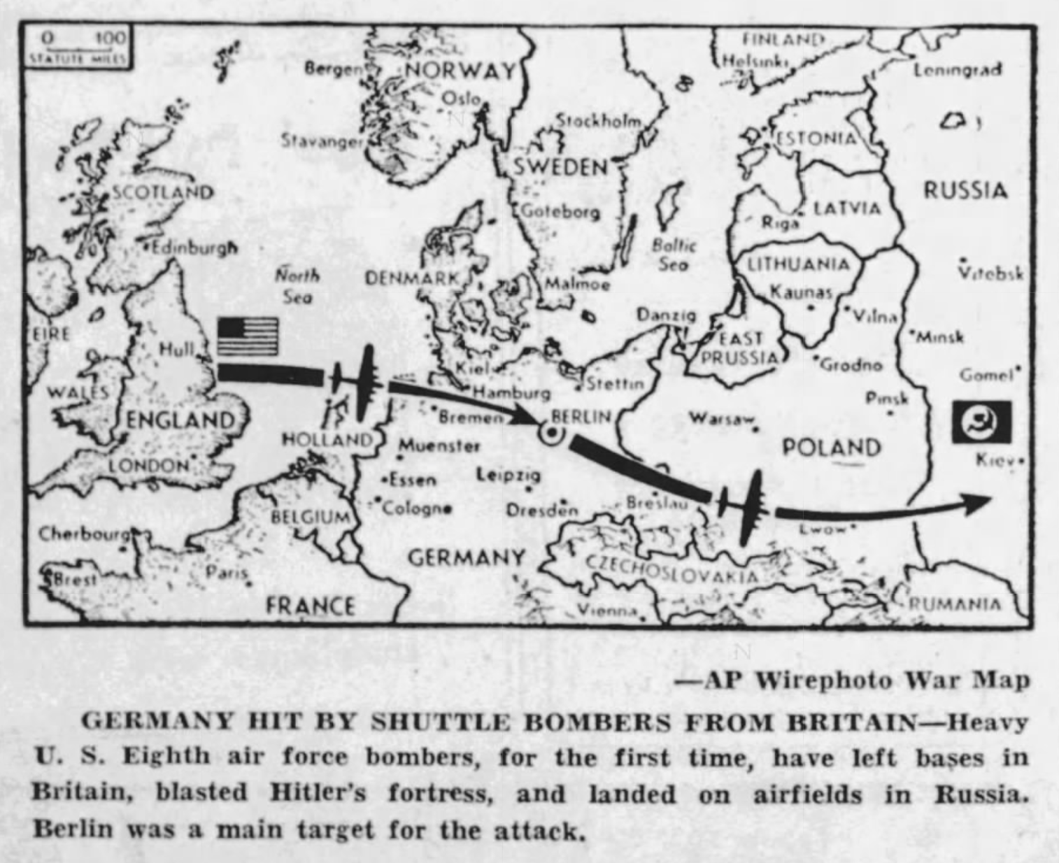 Associated Press map shown in the Tampa Tribune, June 23, 1944. (Newspapers.com) | For a reader at home, that map conveyed the immediate news story — the novel deployment from the U.K. to the U.S.S.R. — while also explaining the orientation of those countries relative to the target, Berlin. Here's another example of how maps convey useful information related to the war in Ukraine. Policy expert Patrick Chovanec used a color-coded map of the country to show the varying geographic constraints an invading force might encounter. While modern air warfare and the presence of a modern highway network reduce the need for such considerations, it does provide a good sense of how the invasion might further progress. The combination of technology and mapping also revealed real-time information about the invasion as it got underway, with apparent checkpoints showing up on Google as traffic jams. There are other ways to understand the geography of Ukraine that are more subtle and that don't involve maps. For example, as I watched CNN's coverage of the first hours of the war on Wednesday night, I noticed that dawn was breaking behind the network's correspondents at different times. Jim Sciutto, at lower right below, was stationed in Lviv. Clarissa Ward, third from the left in the top row, was in Kharkiv. The sun was up there, in the country's northeast, but Lviv, near its western edge, was still dark. That small detail gave a sense both of positioning and of the breadth of the country. 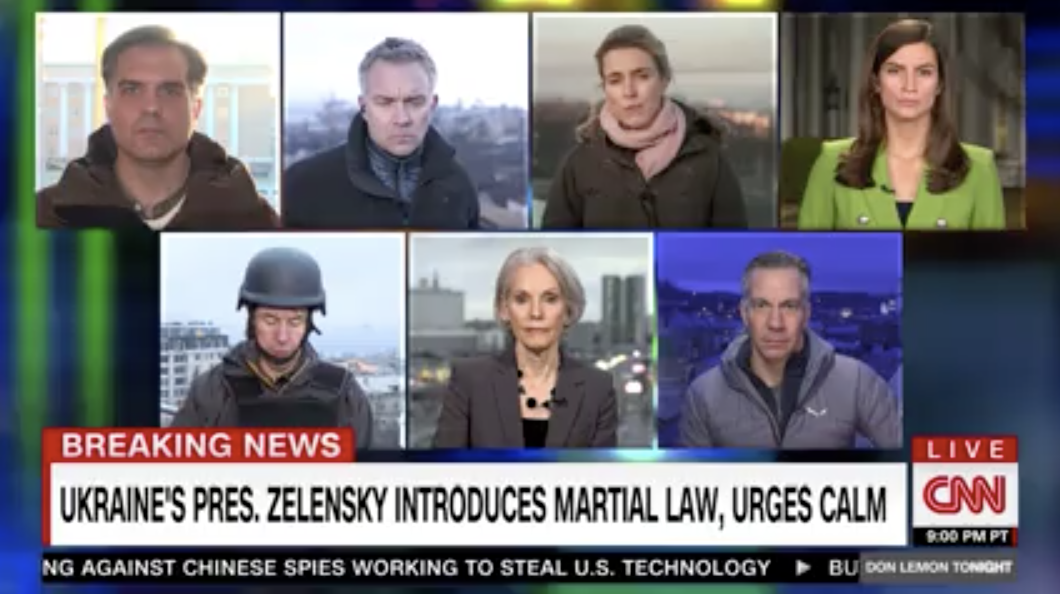 Still from CNN early Thursday morning. (TVEyes) | There are lots of ways to learn the details of a country's geography. War is unquestionably the worst one. | 


0 Comments:
Post a Comment